The Blue Node
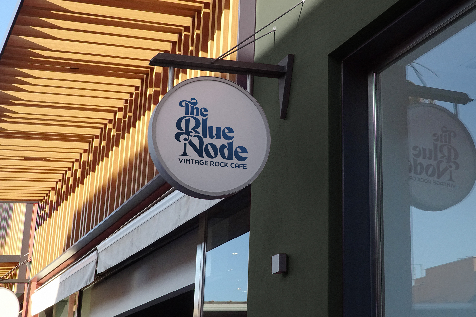
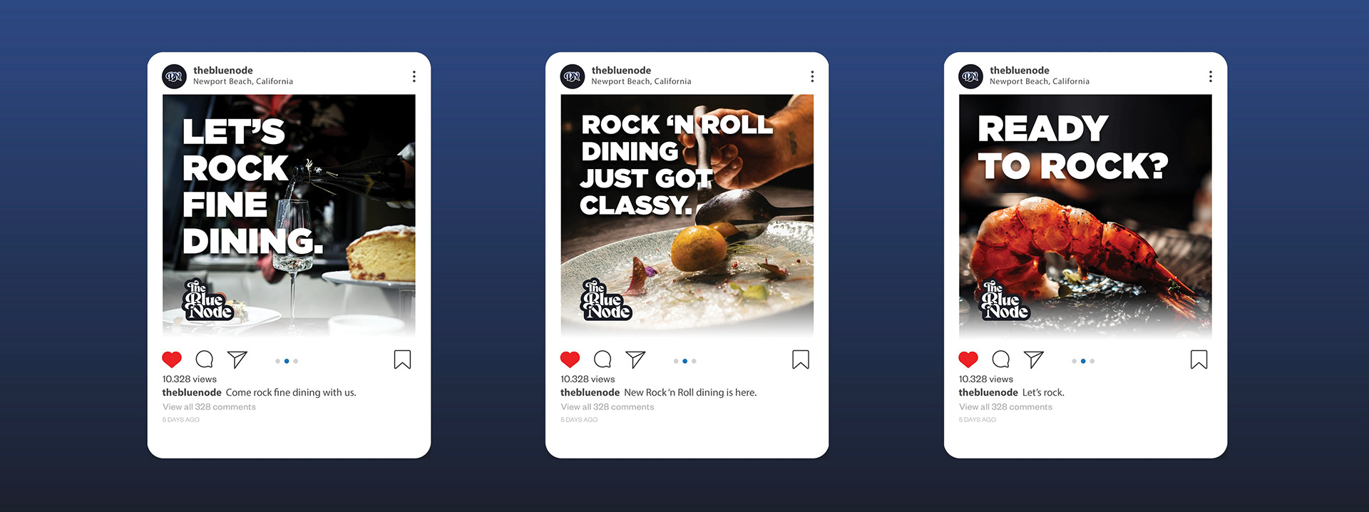
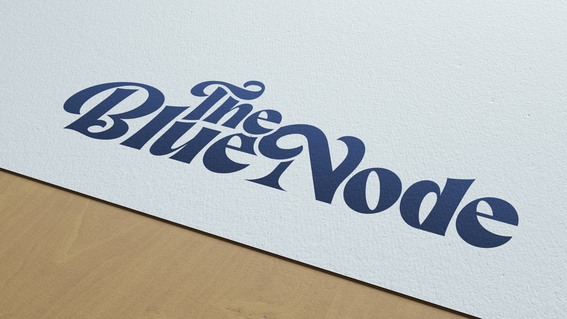
The following are branding deliverables for The Blue Node—promoting the high-class dining experience coupled with rock and roll music. Only at The Blue Node. To view the entire brand style guide, click the button below.
National Bicycle Dealers Association Rebrand
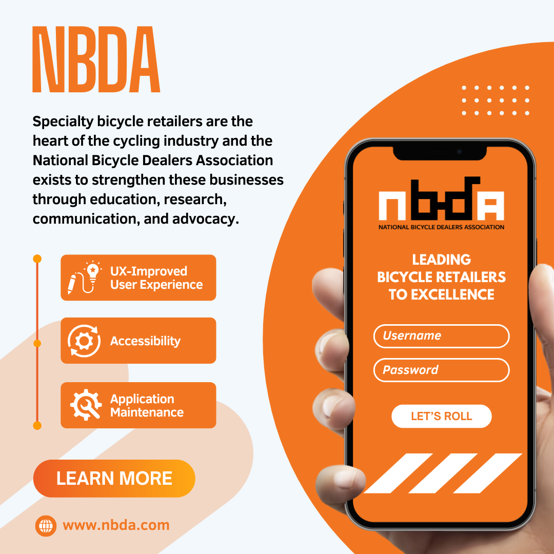
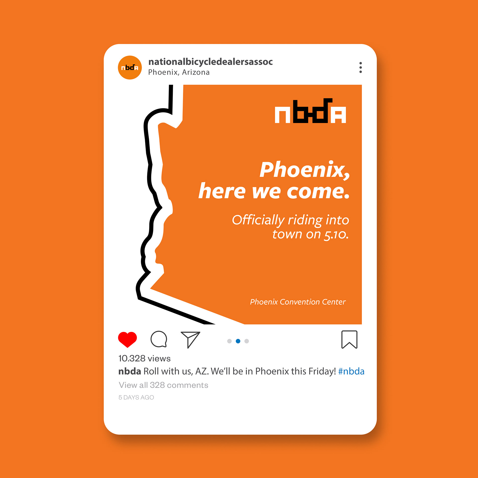
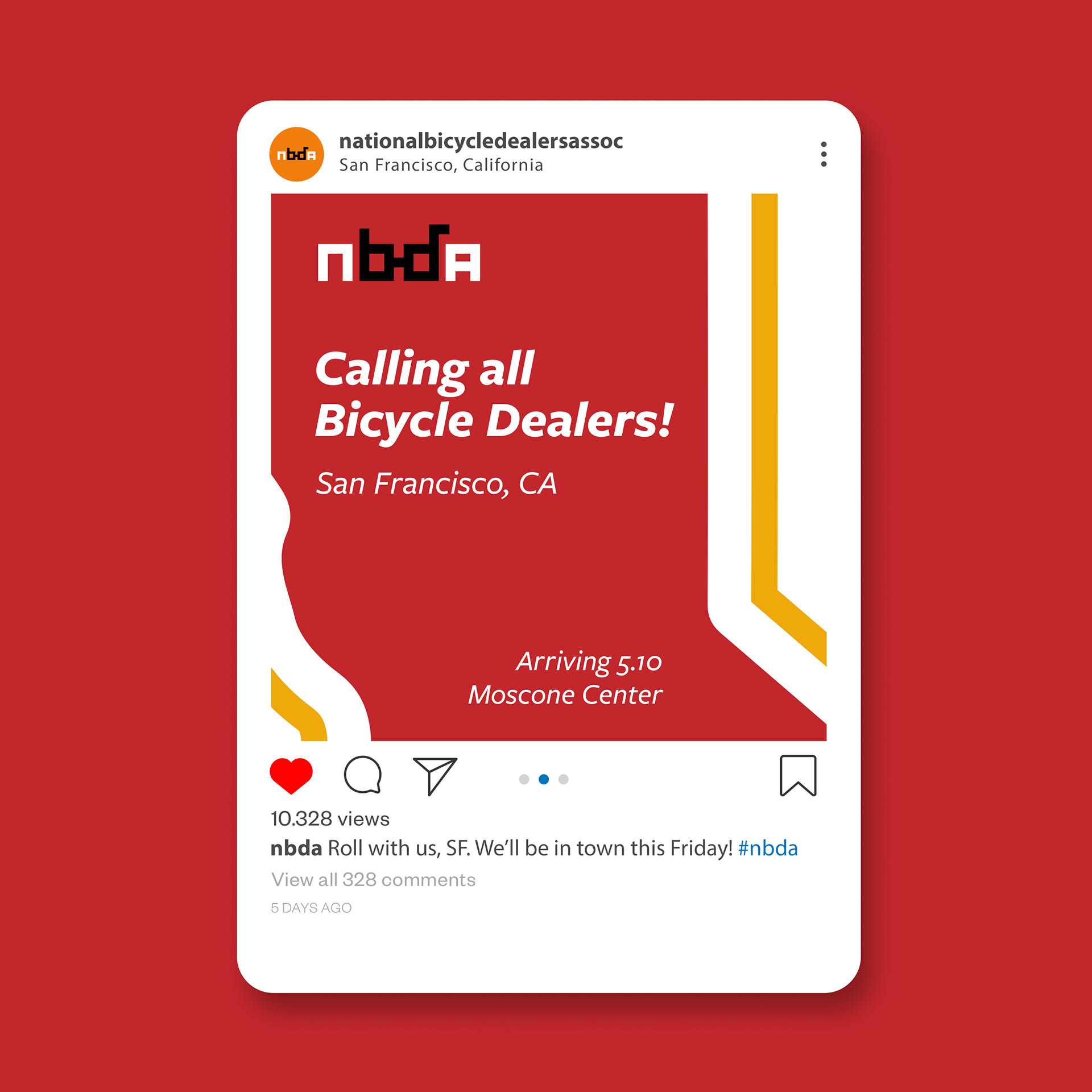
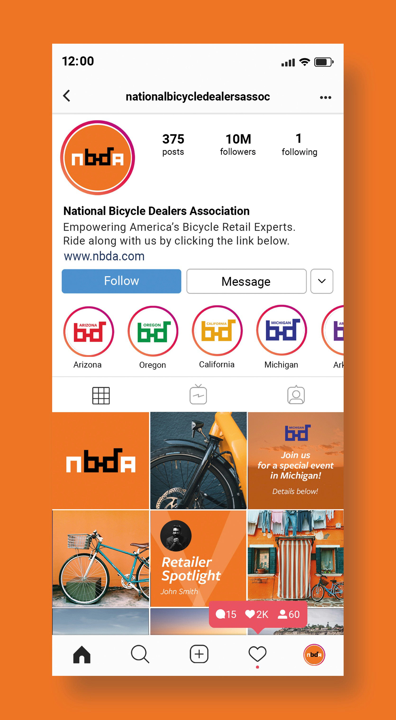
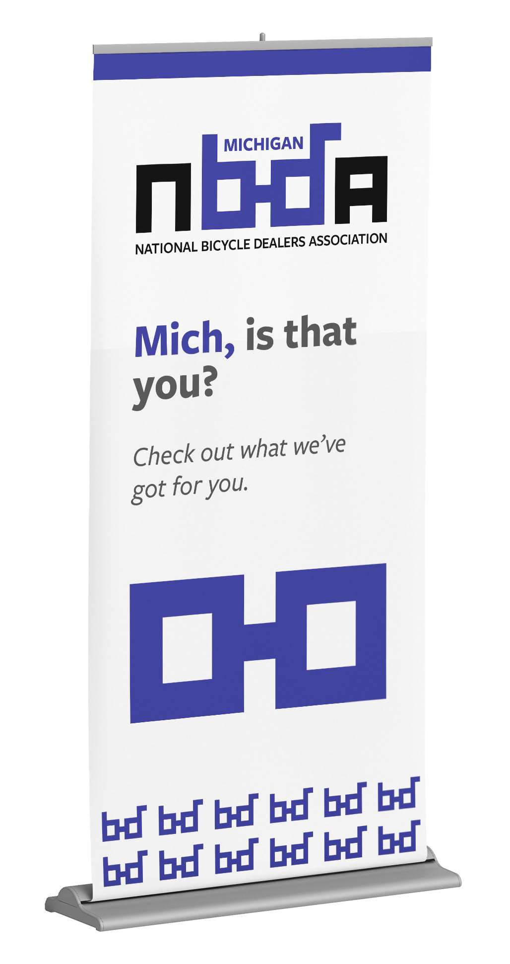
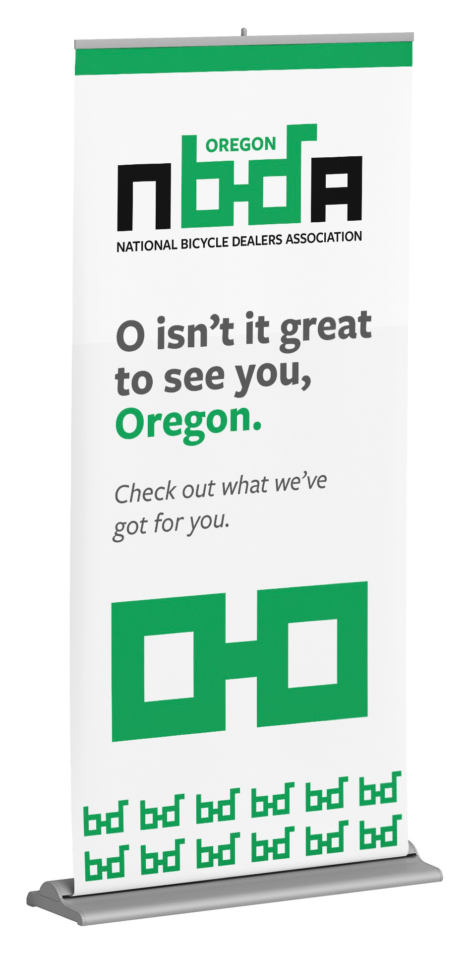
The following are branding deliverables for the National Bicycle Dealers Association (NBDA). The goals here were to refresh the brand’s identity (as discussed previously), refine the brand’s voice and tone, and give the brand valuable assets for their marketing and promotional needs. With this, the NBDA can establish a consistent brand identity, thus improving their business. To view the complete rebrand deck, click the button below.
National Park Service Rebrand

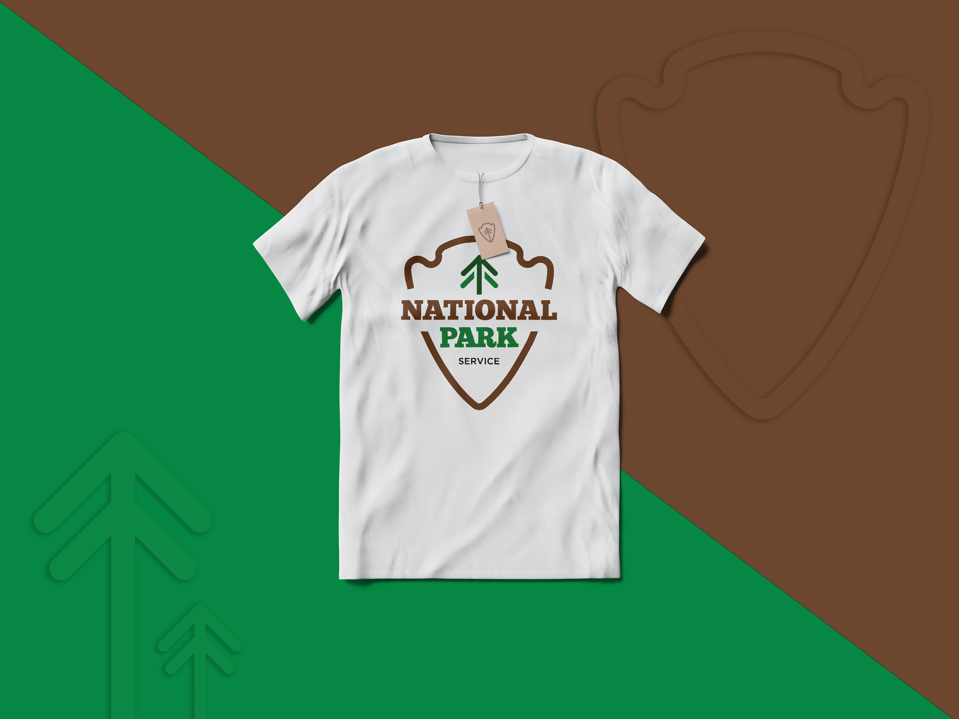
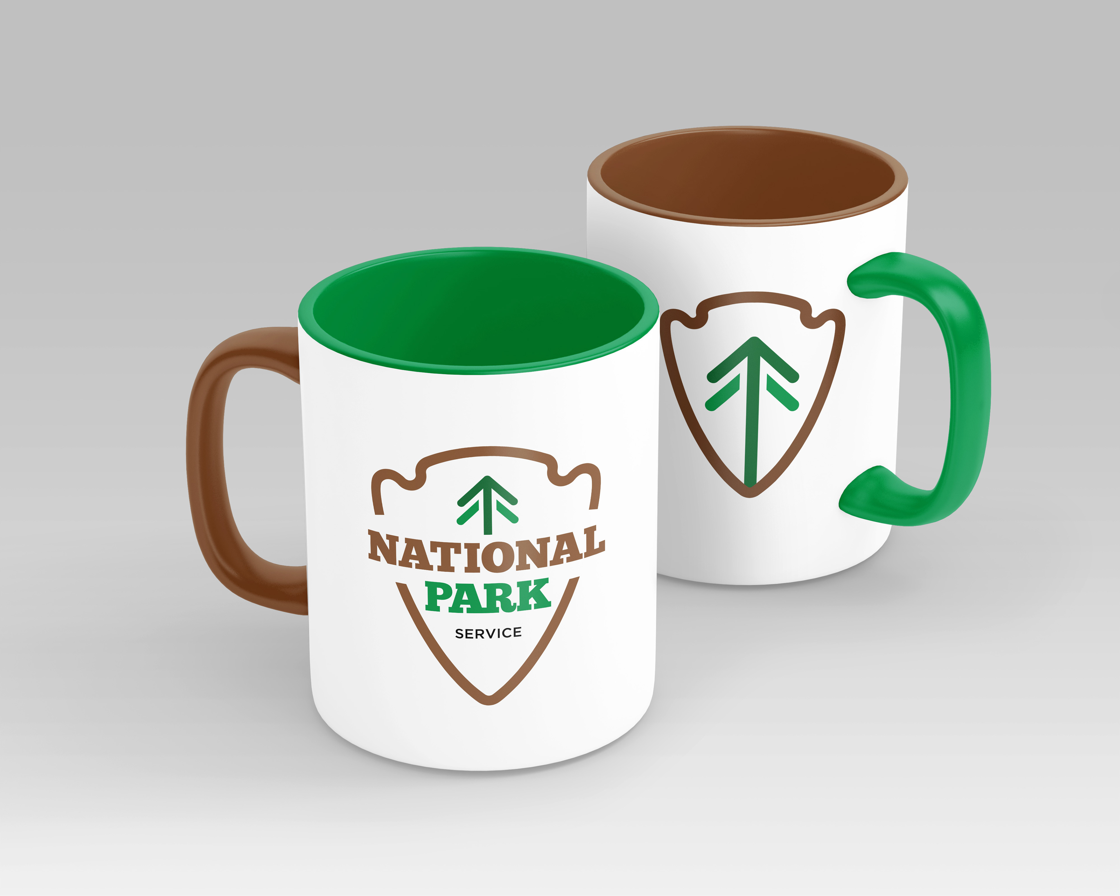
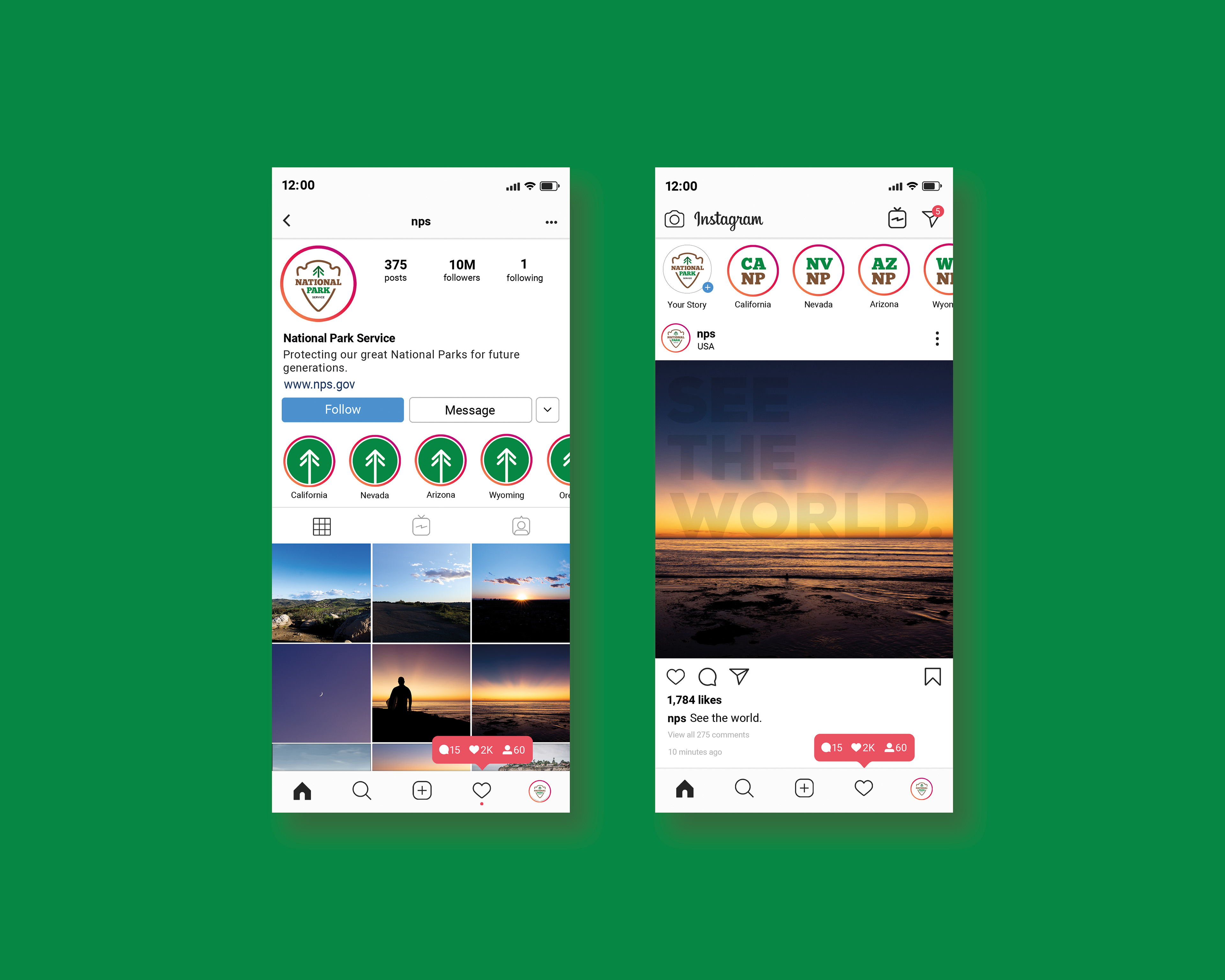
Founded in 1916, the National Park Service is the federal agency that oversees all of the National Parks within the United States. It’s time to give them a refresh. For this project, I re-designed their logo to bring it into the 21st century. Since the National Park Service is a signal of authority, I chose to go with a slab serif font. This font also works well with keeping it a bit rugged and natural. Traditional earth-toned colors of green and brown were chosen for simplicity, as well as the arrowhead and tree icon to symbolize the outdoors. With this, the logo remains traditional but with a modern twist.
Table & Eve
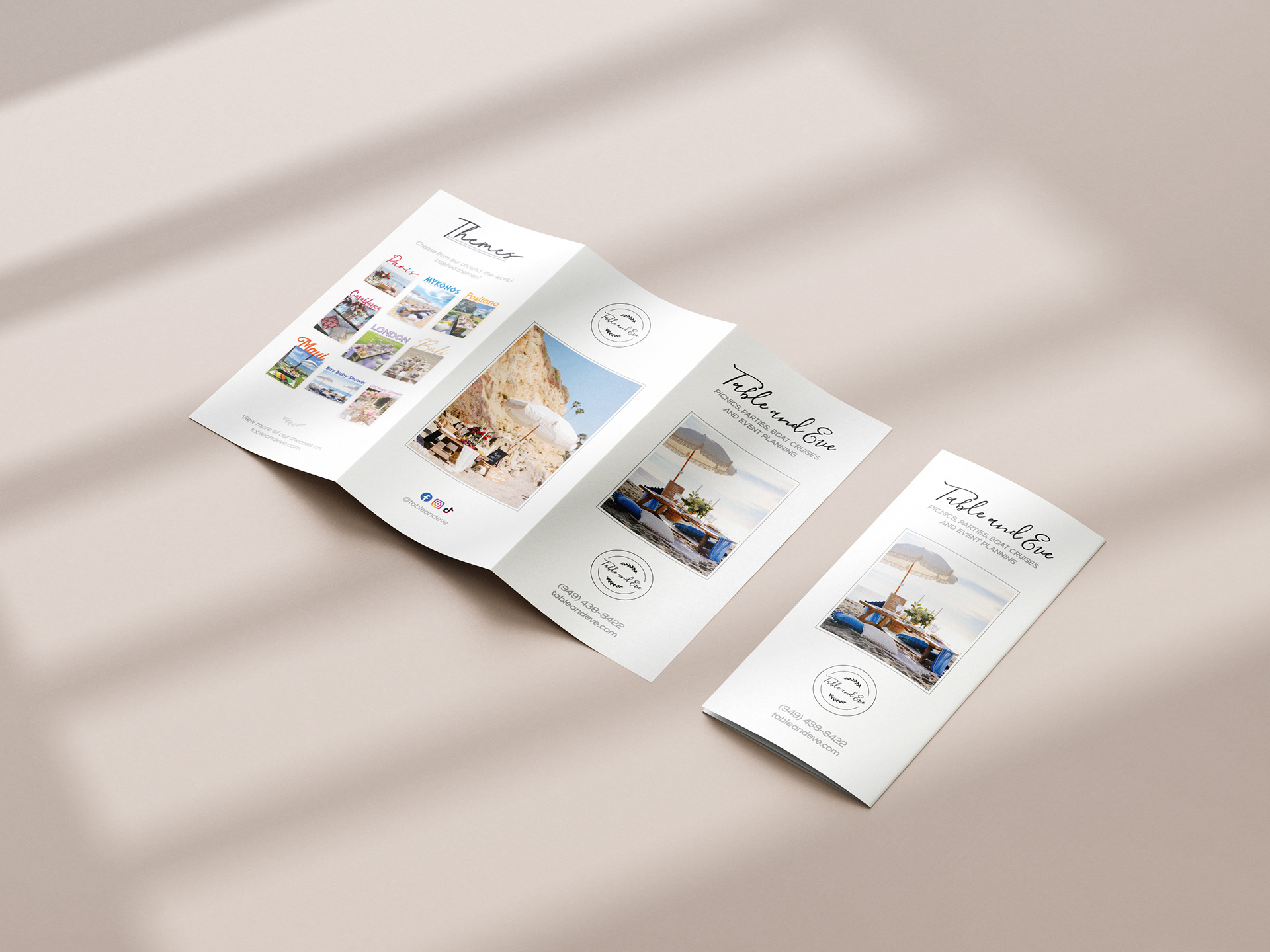
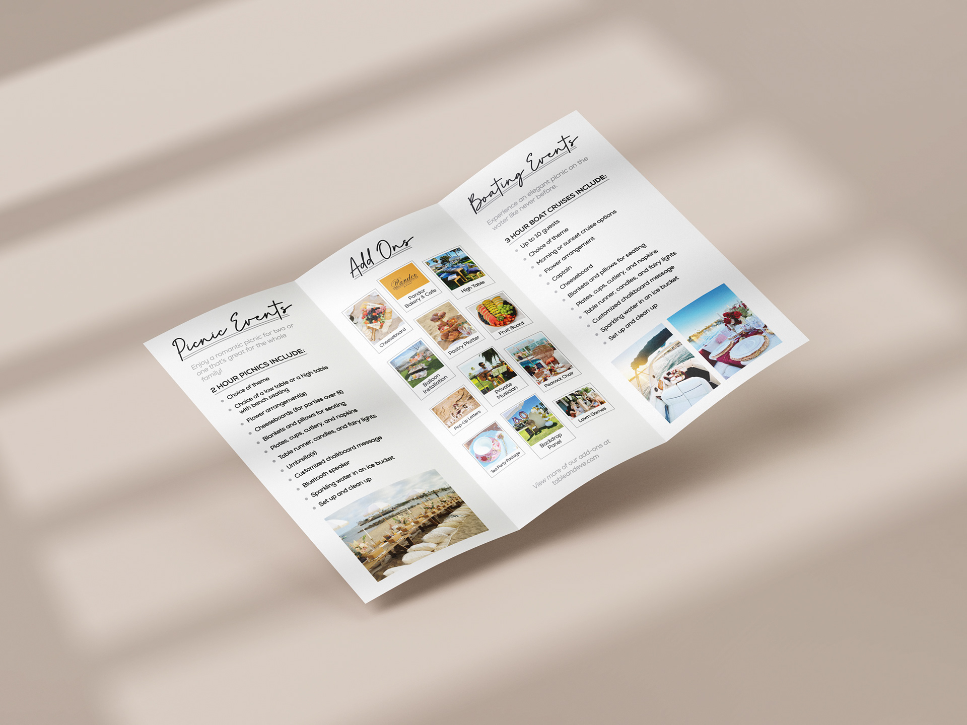
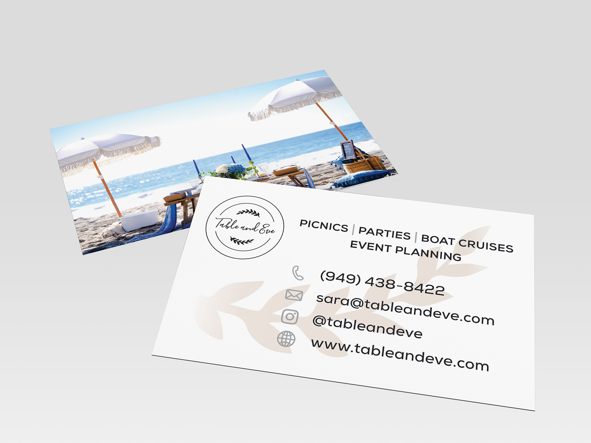
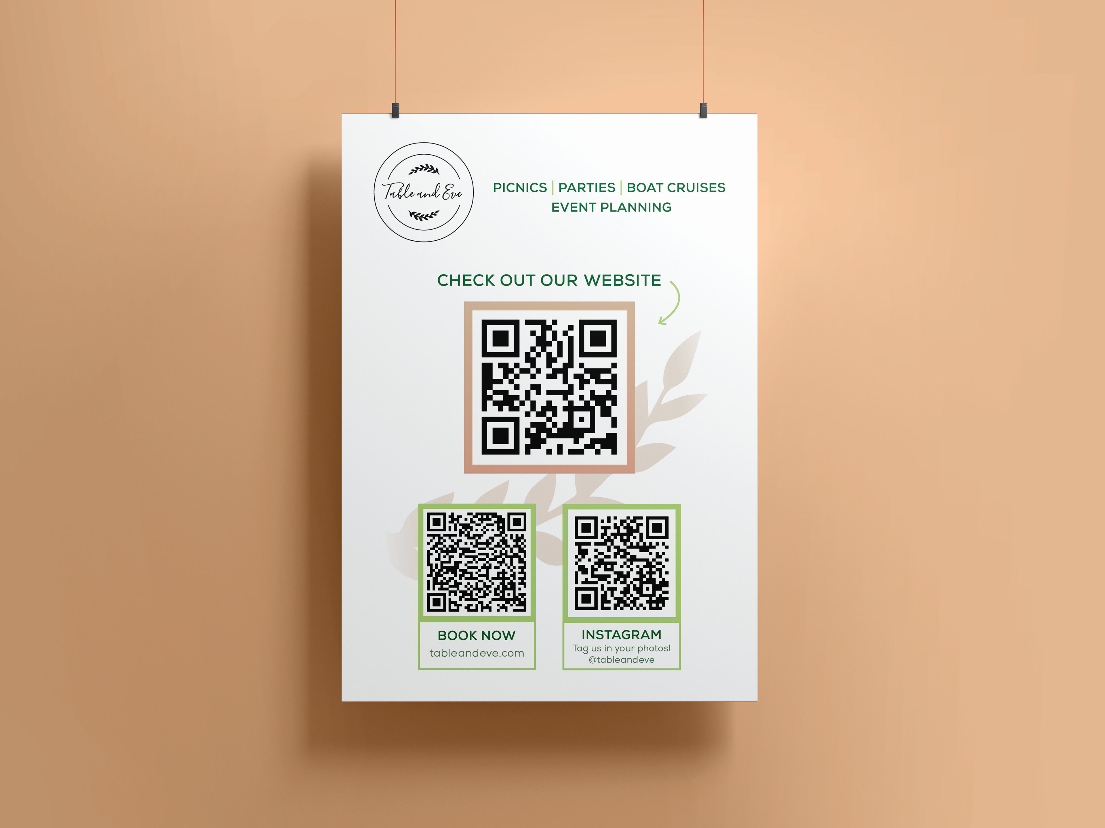
Table and Eve is an event company that specializes in setting up picnics on the beach, boat cruises, celebrations and parties, and more. They contracted me to design their brochures, business cards, and flyers. Keeping the font large, simple, and easy to read for clients—as well as adding in pops of bright colors and images—helps to attract attention while still giving off a very beachy and summery vibe—the ideal time to inquire for a picnic.

