The Blue Node
This project included designing a brand identity and style guide for a mock restaurant. I chose to complete this project on The Blue Node—a luxury dining experience that transports you back into the rich history of rock and roll. When designing the logo, I made sure to seamlessly integrate a foundational symbol of music—the music note. Accomplished was a flowing, yet sharp logo that was a representation of rock and roll music at the time—groovy and trend-shattering at the same time. To view the entire brand style guide, click the button below.
National Bicycle Dealers Association
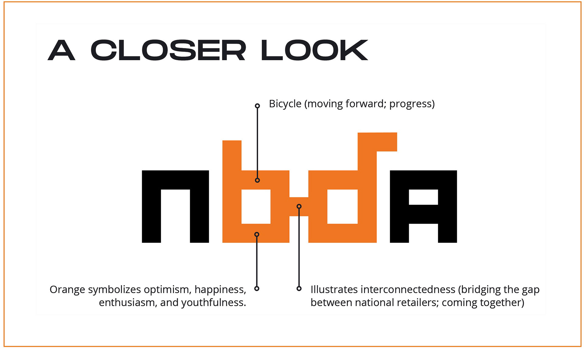
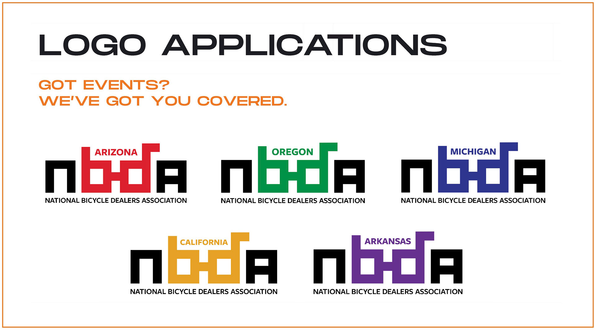
The National Bicycle Dealers Association (NBDA) is a non-profit that is supported by the membership of national bicycle retailers and industry allies. For this project, I decided to give them a brand refresh. With a vibrant new logo and various applications for it, the NBDA has a bright future ahead of itself. To view the complete rebrand deck, click the button below.
Personal Logo
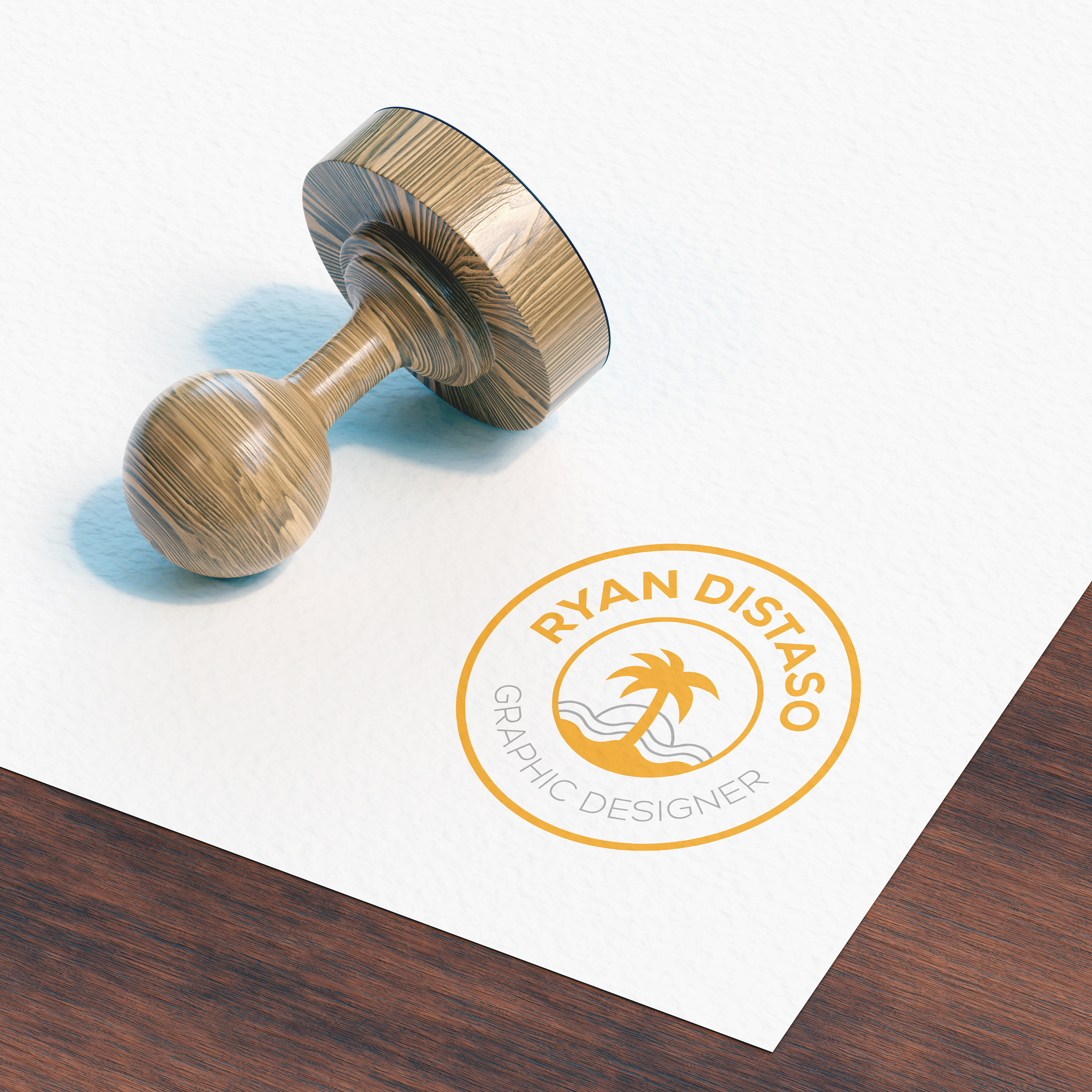
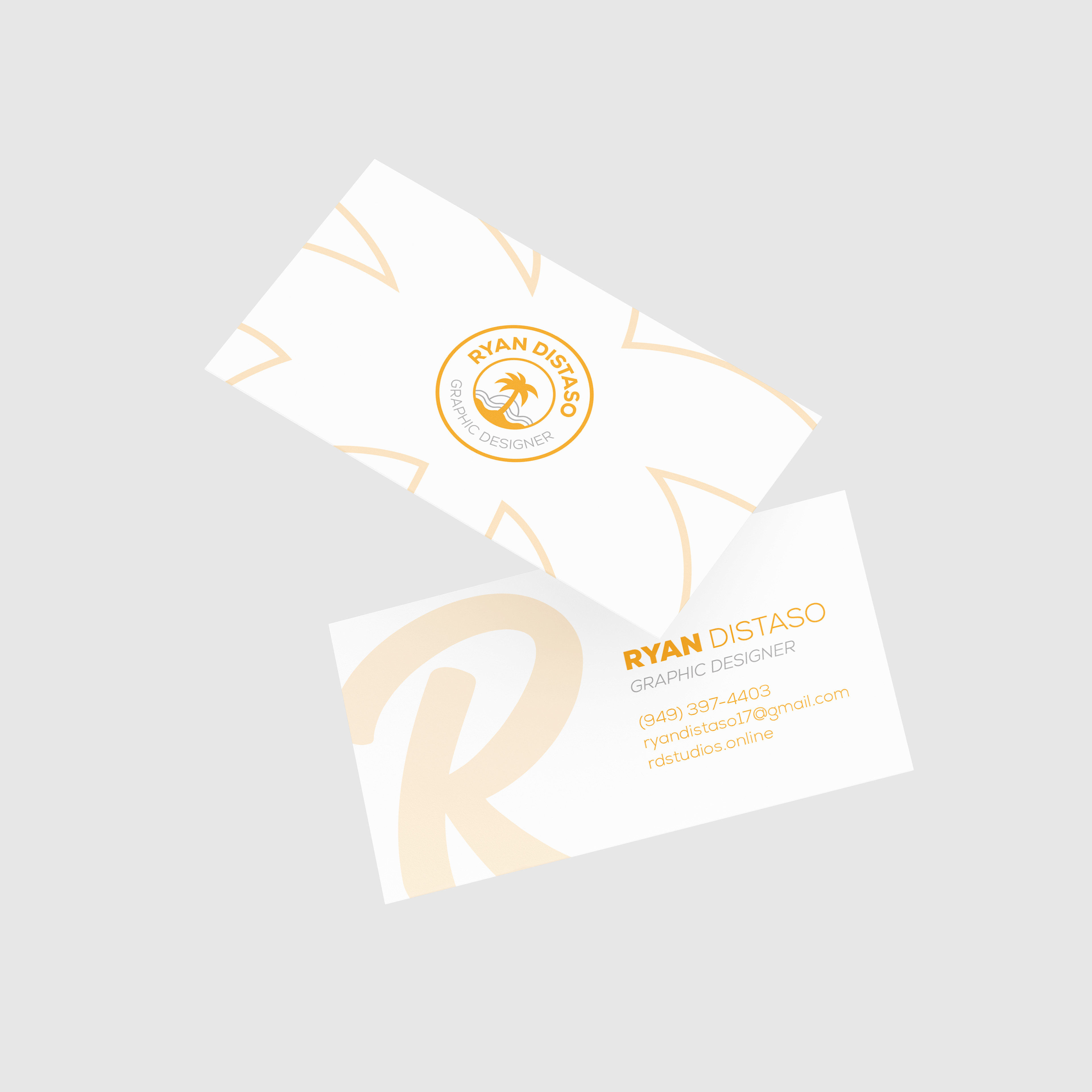
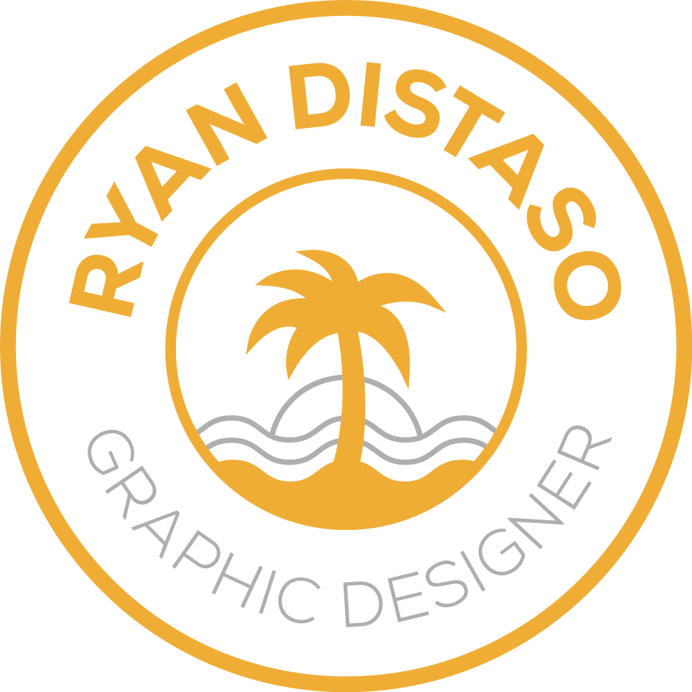
This is my personal logo design. When designing my logo, I wanted to showcase my love for the outdoors. So, with this in mind, I combined my two favorite things about the outdoors—the beach and sunsets. The gold color scheme used here as well as the sans-serif fonts help to convey my clean, high-quality work ethic that I bring to design.
Black House Coffee
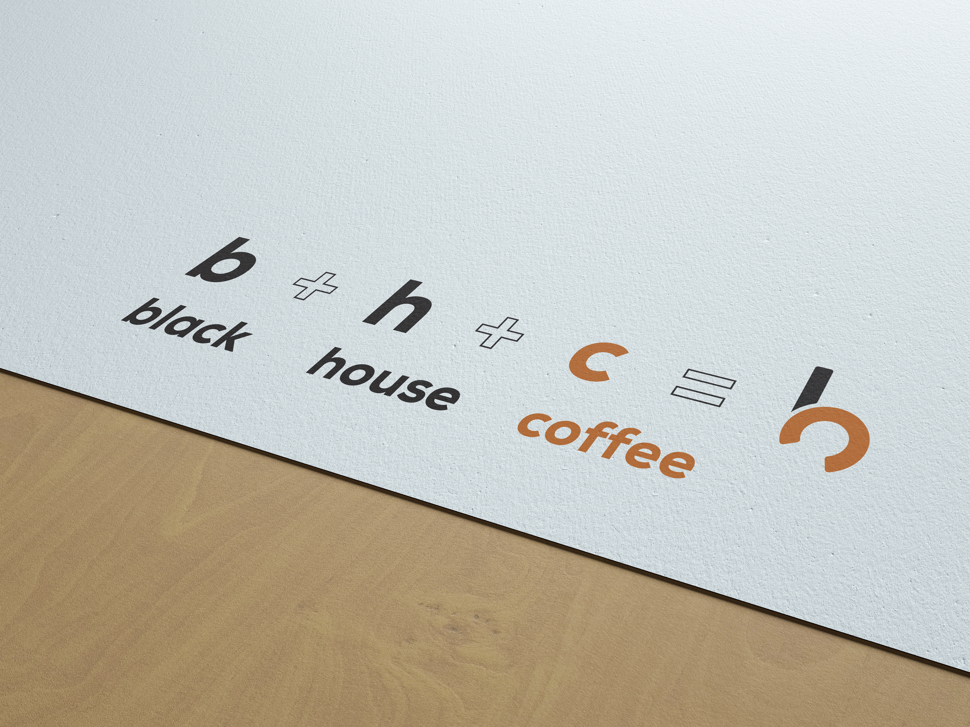
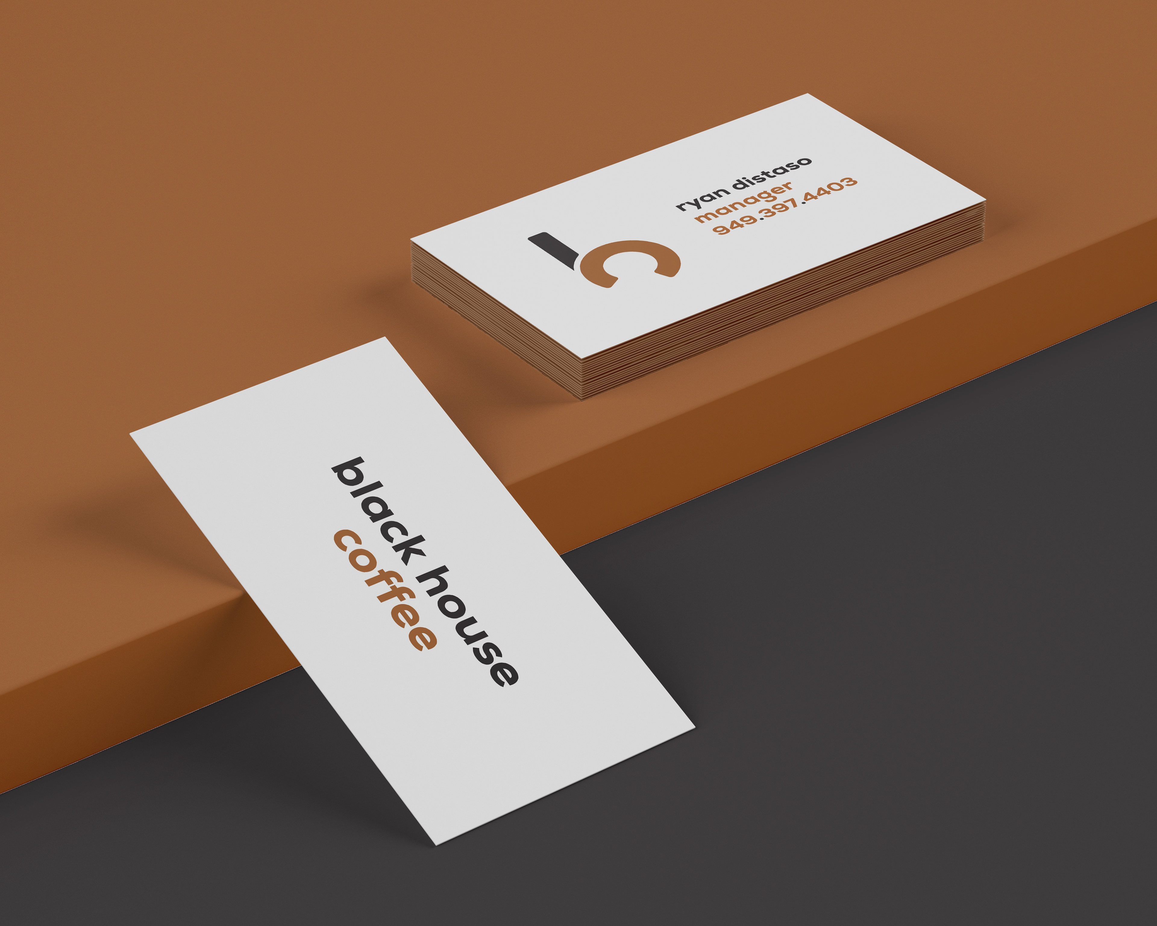
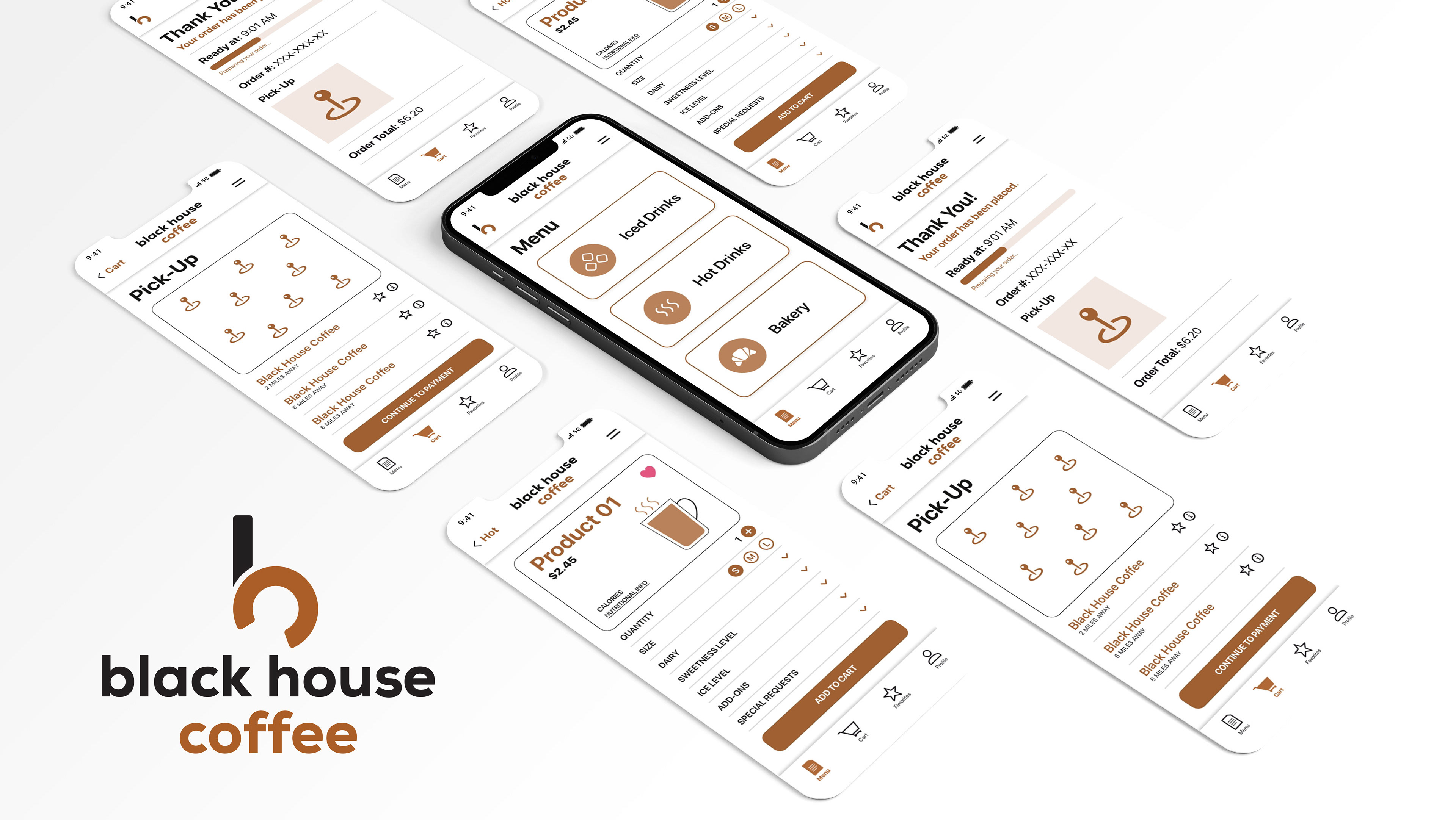
Black House Coffee is a fictitious coffee shop that is known for its (you guessed it) coffee. When designing the logo mark for Black House Coffee, I made sure to include each of its first letters—B, H, and C—in order to create a logo mark that was distinct, while also being memorable. In the end, you can distinguish each of the three letters in the logo mark thanks to the colors and use of gestalt principles. Rounded corners of the logo mark as well as the lowercase letters on the logo type help make the establishment feel more friendly and approachable. Traditional coffee colors were used.
